.png)
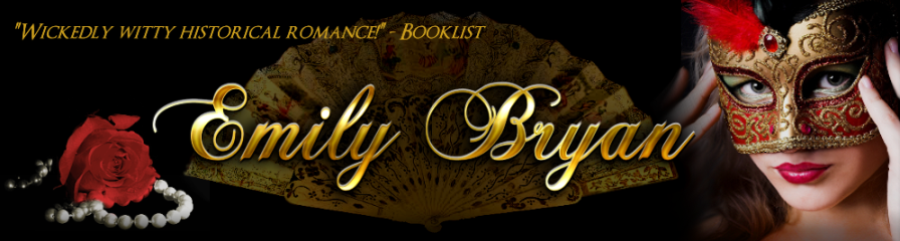
As it turns out, it is an infringement of copyright for me to use only part of the art work from my covers. Legally, I'm only allowed to display the entire cover on my website. So JennJ of Sapphire Designs took a royalty free stock photo I'd purchased for use on my site and added some of her own elements to come up with this new look for my header:
.png)
I love it! Now I have to pick some things to go with it. Here are my new choices:
This red is leaning far more orange than I usually like to go, but it does pick up the color of the masked woman's feather nicely. The color is cheerful, which communicates the light-hearted feel of my stories.
This gold adds some texture to the site as well, because it's a jpg of gold fabric instead of a flat color. But I wonder if it doesn't read as a bit too busy to be a background?

And of course, I want a deep color option, so I thought I'd offer this darker red for your consideration. I've used the gold as an accent behind the book cover on this one.

And if I want to take the lazy author's way out, I could always leave my current background in place. It's a soft collection of feathery colors that seems to work fairly well with the masked lady's lipcolor. Since my website has half a gagillion pages, this would certainly be the easiest option.
But if I wanted easy, I wouldn't have become a writer.

Oh! And JennJ just sent me this victorian tile to try. Since it's hard to see the detail of the texture in the thumbnail, I've included the tile itself for you to check out.
.png)
So one more time, I'm asking for your opinion about which color I should choose for a background with JennJ's lovely header design. Thanks for weighing in! I'll let you know when the new look goes live!
17 comments:
The background colors all look wonderful with the beautiful header JennJ created. The brighter red does make the mask pop nicely. Howver, I like the darker red best beause it makes the gold really gleam.
Thanks for sharing, Jena. I got a similar comment on my Facebook about that dark shade.
I like the dark red or the victorian pattern best. WOW! I love the banner, that is much much better!!
The background you have already with that gorgeous banner is perfect.
Thanks, Jane. That seems to be the consensus so far.
You're tempting me, Glynis. Especially now that I'm starting a new story, it's hard to think about dedicating the time to changing so many pages. Slipping in the new header only would be a quick job.
Kudos to JennJ. I like the new design also. I like the gold color, your current one, or the victorian tile. I prefer some texture rather than just the flat color
I really like the dark red or the victorian tile background. Although, I don't think any of these would be wrong! I love the mask the lady is wearing!
Nice banner, and I love the victorian tile! I love the sculpted old pattern, too, but if you really want to renew things...
Mary--Jenn did a great job and so quickly. She amazed me with how fast she came up with a different header.
Carolyn--I love that masked pic, too. She was sort of the inspiration for Daisy masquerading as a French courtesan in VEXING THE VISCOUNT.
Nynke, you're right. I can't wimp out, can I?
Great banner ... I love the sophistication of the 'masked lady', and even more your name in the metallic gold ... just a touch of "Victorian bling"!
Now, I can't believe I'm saying this, but I really like your current background with the new header! As much as I WANT to like the gold, with it's texture and lighter color (and I like the lighter colors because they seem more cheerful to me, and your stories are not 'dark', even though they often contain some mystery), I feel it distracts the eye from the header itself. (It does make a good background for the book cover; perhaps the Victorian tile might do the same. Depending on the colors in the covers; you may need several colors of backgrounds to put them on.) And I like the Victorian tile, but the color is slightly different from what you have now, and the current one has nice texture, and a bit of flirtatiousness, if you'll allow me a flight of fancy.
I also agree with your point about spending time changing backgrounds on zillions of pages when you COULD be writing ... but I'm still shocked that I'm not advocating for something new and different! Sorry, Nynke, I usually find your comments right on point -- but on this, I gotta agree with Glynis. Oh, and Emily, this does not mean I've changed my mind about your needing colorful walls at home! :-)
Emily, I think all of the backgrounds are very nice. The gold one is my
2nd choice, but I really like the dark red, Victorian tile background.
The header is romantic and mysterious; I really like it!
Marcy--Some might label you and Glyis "enablers." LOL.
As far as the time spent goes, I try not to write on the weekends, so while the DH watches pre-season football, I could certainly be pointing and clicking on Frontpage to update the website.
I'm taking your advice and watching more HGTV when I have time, hoping their color sense will rub off.
Thanks Deb. I appreciate your opinion.
Well, Marcy, I wasn't actually saying outright that changing all the backgrounds would absolutely be worth Emily's trouble ;). I kind of agree the difference is slight, so Em... call me an enabler, but it's all down to what you want to do, of course! (Still, a new pattern might be fun. Just a thought. *grin*)
Post a Comment